
Viewing vibration data
In the Vibrations menu inside a project you can view the measured vibration data interactively.
The first step is to select the measurement points you want in the left column.
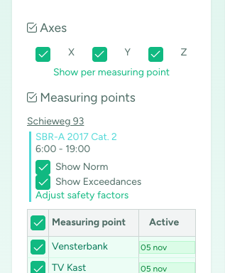
Then, in the filter section on the right, select the time range and resolution you want.
The resolution determines how many data points are loaded. The more data points, the more detail, but with too many data points it can take a long time for the plot to load. To prevent overloading the browser, the data is downsampled automatically. You can turn this off or adjust it by clicking Downsampling.
Click LOAD to load and plot the data.
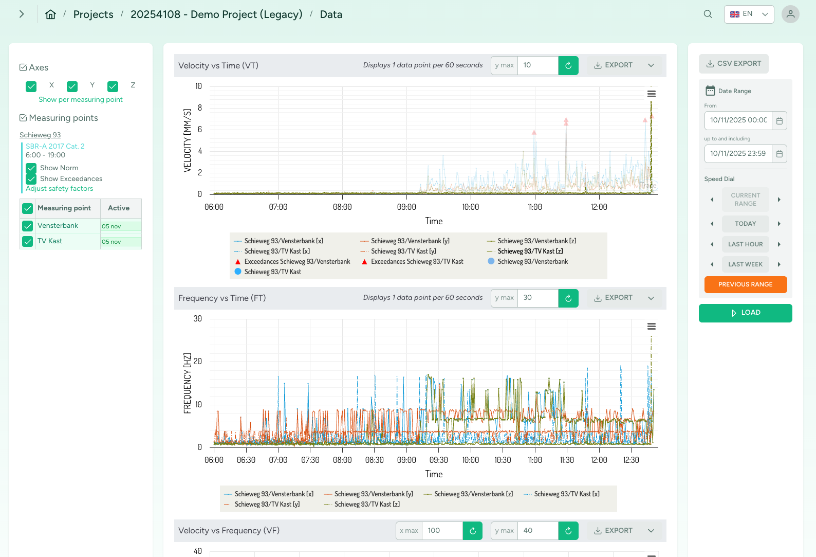
The right plots are shown automatically for the data that is available. This can differ per cluster and depends on the measurement configuration.
Measurement points that are selected at the same time are plotted on top of each other so you can compare them easily.
The plots are interactive. If you zoom in one plot, the other plots zoom along where possible. After zooming it can be useful to click LOAD again (or press Enter) so the data is loaded at a higher resolution. This lets you see more detail.
Traces
A Trace is a piece of real-time measurement data that can be saved around a specific configured trigger.
By real-time measurement data we mean actual measured values, of which the sensor generates 1000 per second. This is in contrast to, for example, SBR data, which at 1 data point per second is a kind of summary of those 1000 measured values. Real-time data gives you more insight into the actual vibration.
A Triggered Trace appears as a small flag in the time domain chart of a measurement point.

Clicking the flag loads the trace data and shows it in both the time domain and the frequency domain (FFT).
Time domain
The chart shows the signal from a few seconds before to a few seconds after the trigger. The trigger moment itself is marked in green.
By default all X/Y/Z axes are visible. As in all other charts in the dashboard, you can hide each axis by clicking that axis in the legend below the chart.

FFT
The FFT shows how the energy of the vibration is distributed over the different frequencies. This is similar to how the meter itself determines the dominant frequency, except that you now see all frequencies.
Important to know: the FFT is calculated over the area marked in gray in the top chart. By default this area is 2 seconds wide around the trigger. This means the frequencies show the average vibration energy per frequency over that time interval. Depending on the trigger moment and the type of vibration, the FFT may not exactly match the dominant frequency according to the SBR.
The choice of these two seconds is a trade-off: if you calculated the FFT over a longer time, you would get a better picture of repeated vibrations, but the effect of a short vibration impulse would fade into the background. Conversely, with a shorter FFT you could no longer properly assess the low frequencies around 1Hz.
Exporting
With the menu button at the top right of the chart you can download the trace data as an image, and also in CSV/spreadsheet format. This lets you process the data further in your own analyses if you want.